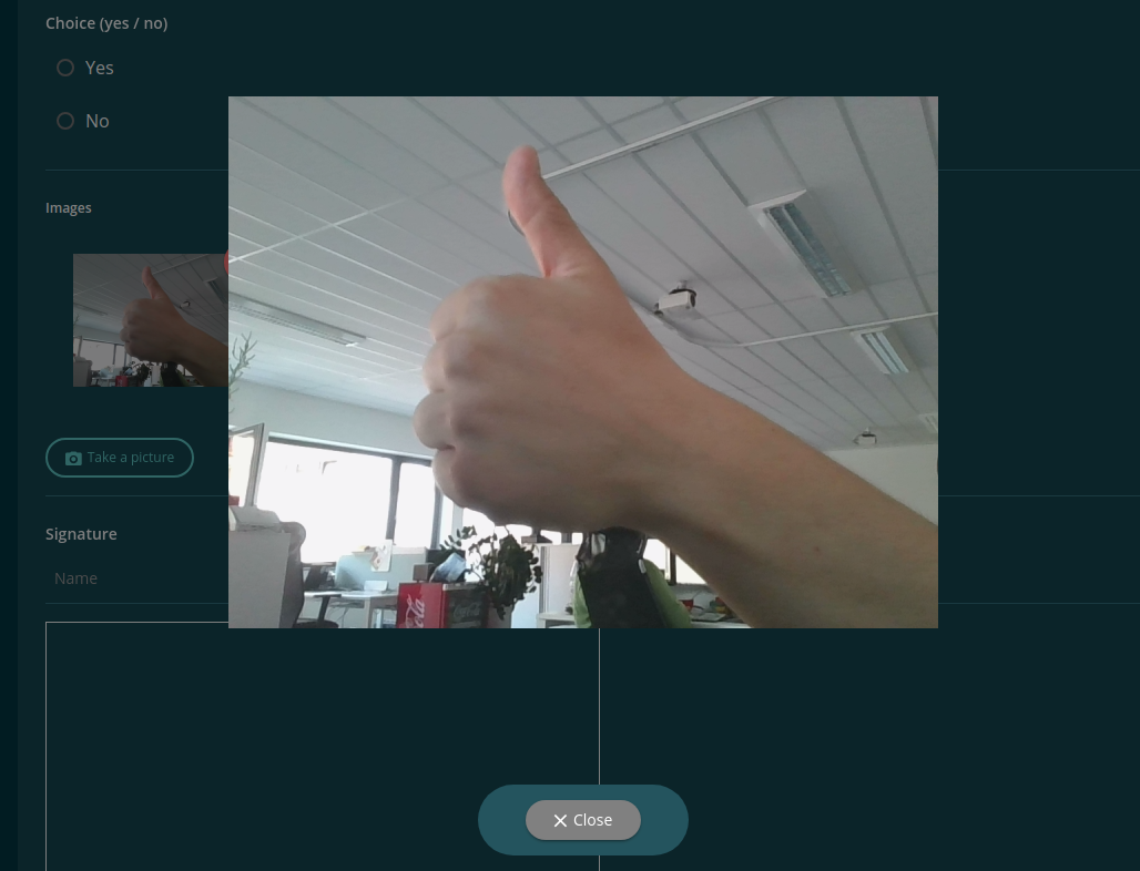
Modal
A modal uses a component, and shows it over each other dapp, dynamic during runtime. How to show modals, have a look at the EvanModalService.
You can simply create your own fullscreen modal style, by add the following style to your modal component:
@import 'ui-angular-sass/src/variables/colors';

modal-component {
  position: fixed;
  top: 0;
  bottom: 0;
  right: 0;
  left: 0;
  margin: auto;
  z-index: 9999;
  background-color: $background-color;
}
To show a modal like a normal popup use the following setup (Reference Implementation):
<div class="evan-modal">
  <div class="backdrop" (click)="rejectDialog && rejectDialog()"></div>

  <img item-start large *oneTime [src]="img" (click)="rejectDialog && rejectDialog()" />

  <div class="button-container">
    <button ion-button icon-left color="medium-gray" round
      (click)="rejectDialog && rejectDialog()">
      <ion-icon name="close" color="light"></ion-icon>
      <span color="light">{{ '_angularcore.form-alert.close' | translate }}</span>
    </button>
  </div>
</div>
View Example
