Content Containers
Should be used for any content container to create uniform and smooth surfaces, with the same spaces and colors. The general class to start with is “evan-content”.
.evan-content
Example
<div class="evan-content">
  <h2 class="content-header m-b-0 m-t-0">{{ 'im-a-header' | translate }}</h2>
</div>
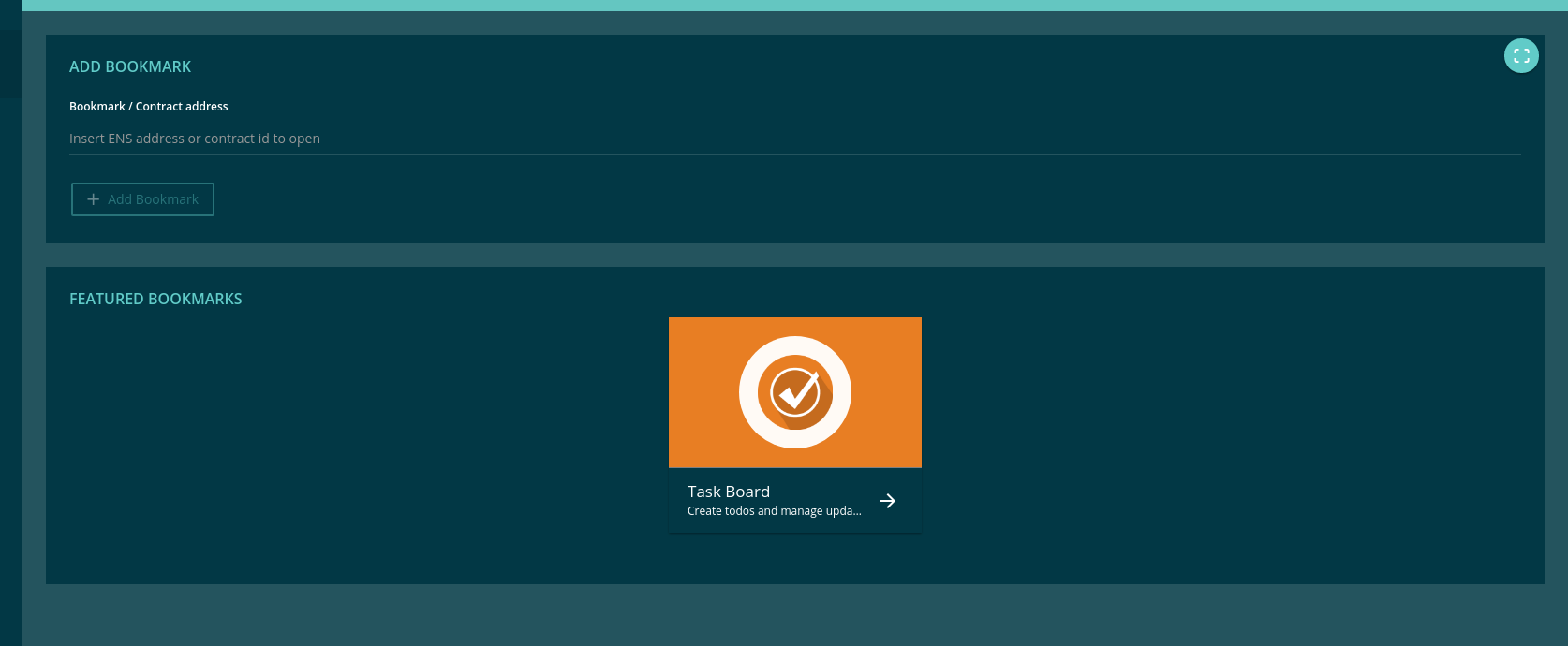
View Example
.evan-full-content
Use always 100% of width.
<div class="evan-content evan-full-content">
  <h2 class="content-header m-b-0 m-t-0">{{ 'im-a-header' | translate }}</h2>
</div>
.evan-small-content
Use a small view with responsive sizes.
- min-width 993px : width 70%;
- min-width 1201px : width 60%;
- min-width 1501px : width 50%;
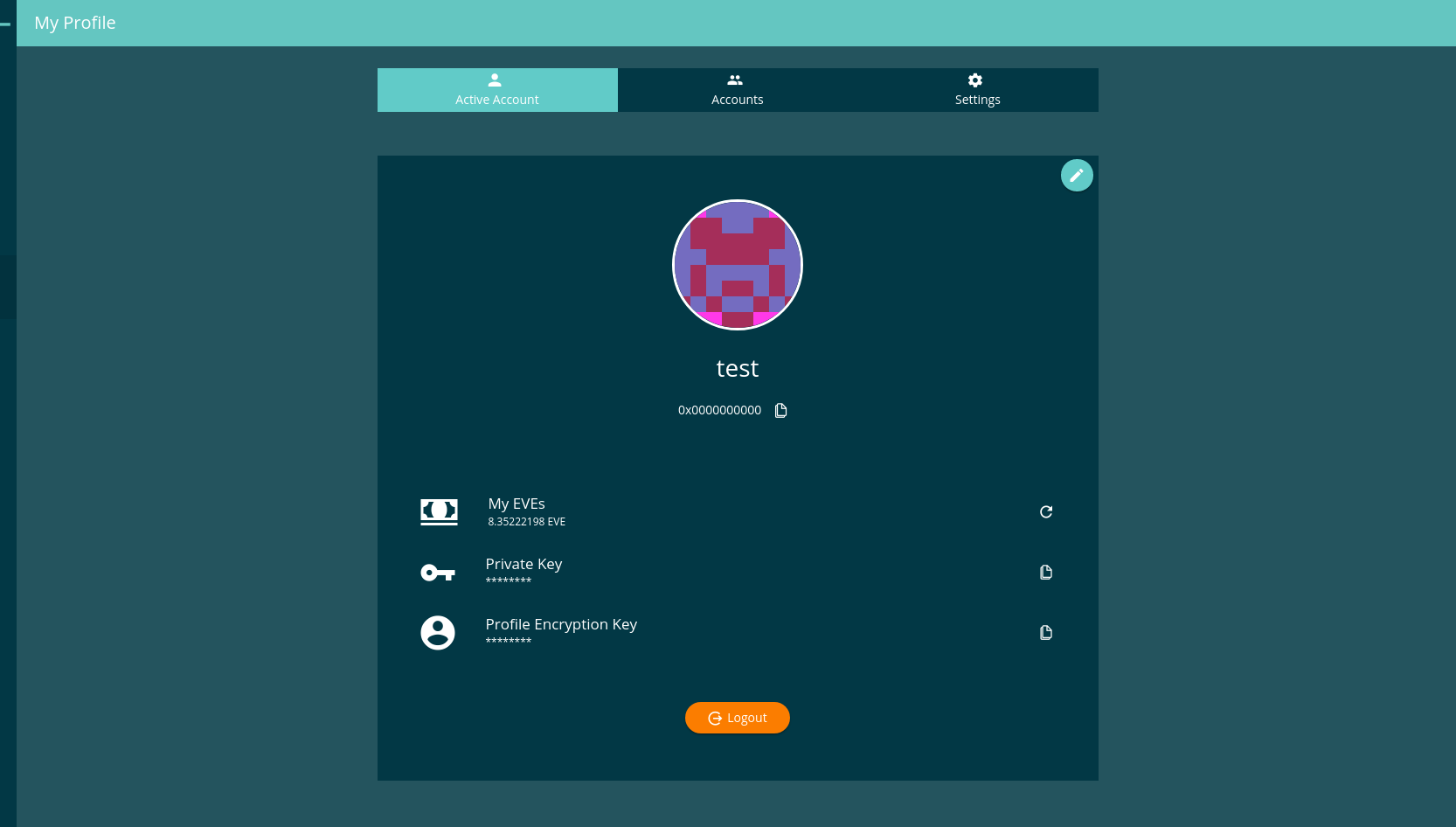
View Example
.evan-mini-content
Use a very small view with responsive sizes.
- min-width 1201px : width 40%;
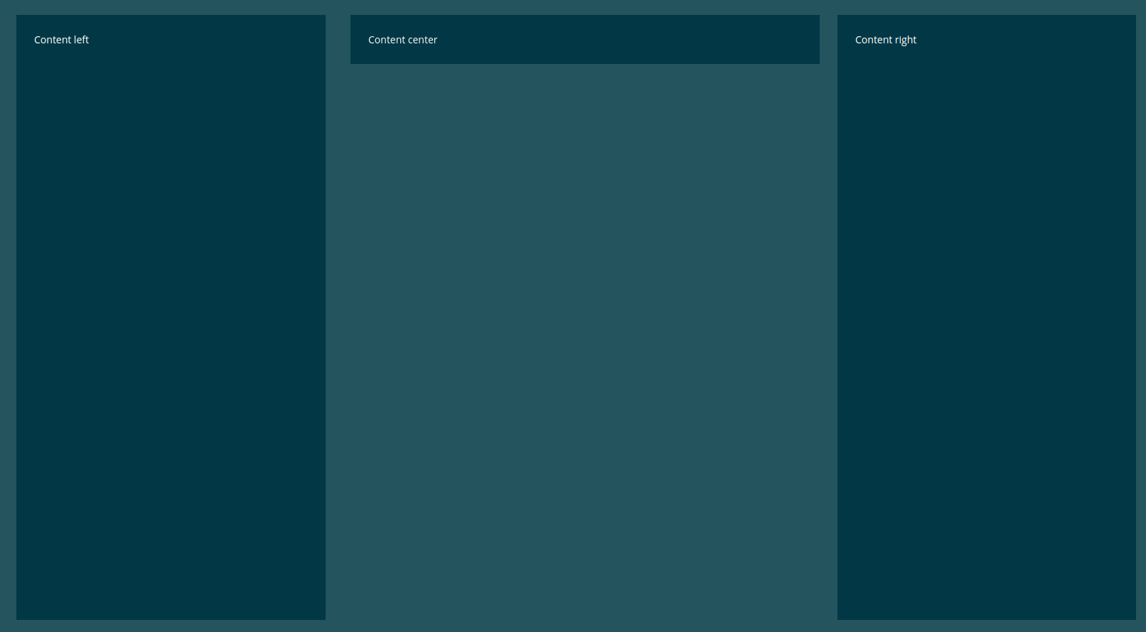
evan-mini-left
Use a very small view with responsive sizes. Perfect in combination with evan-mini-content for a responsive 3 column layout.
- min-width 1201px : width 30%;
- position: fixed (used within dapp-wrapper)
- left: 0
evan-mini-right
Use a very small view with responsive sizes. Perfect in combination with evan-mini-content for a responsive 3 column layout.
- min-width 1201px : width 30%;
- position: fixed
- top: 56px (used within dapp-wrapper)
- right: 0
Example
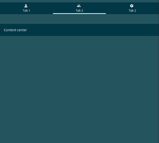
<div class="evan-tabs evan-content evan-small-content" *ngIf="core.utils.screenSize < 1201">
  <button ion-button icon-left clear
    [class.active]="activeTab === 0"
    (click)="activateTab(0);">
    <ion-icon name="person"></ion-icon>
   Tab 1
  </button>

  <button ion-button icon-left clear
    [class.active]="activeTab === 1"
    (click)="activateTab(1);">
    <ion-icon name="people"></ion-icon>
    {{ '_dappprofile.accounts' | translate }}
  </button>

  <button ion-button icon-left clear
    [class.active]="activeTab === 2"
    (click)="activateTab(2);">
    <ion-icon name="settings"></ion-icon>
    {{ '_dappprofile.settings' | translate }}
  </button>
</div>

<div class="evan-tabs-container" [@tabSlideTransition]="activeTab">
  <div class="evan-content evan-mini-left" *ngIf="activeTab === 0 || core.utils.screenSize > 1200">
    Content left
  </div>
  <div class="evan-content evan-mini-content" *ngIf="activeTab === 1 || core.utils.screenSize > 1200">
    Content center
  </div>
  <div class="evan-content evan-mini-right" *ngIf="activeTab === 2 || core.utils.screenSize > 1200">
    Content right
  </div>
</div>
.evan-twoline-content
Display two content containers next to each other using display inline-block. On small devices they will move one under another.
Example
<div class="evan-content evan-twoline-content">left</div>
<div class="evan-content evan-twoline-content">right</div>
.evan-threeline-content
Display three content containers next to each other using display inline-block. On small devices they will move one under another.
Example
<div class="evan-content evan-threeline-content">left</div>
<div class="evan-content evan-threeline-content">center</div>
<div class="evan-content evan-threeline-content">right</div>
.evan-info-button
Display a button on the top right corner with the fixed size of 35px:35px.
Example
<div class="evan-content">
  <button class="evan-info-button" ion-button icon-only>
    <ion-icon name="info"></ion-icon>
  </div>
</div>
Custom botton positions
button.top-right
Display a button on the top right corner of the evan-content. Be sure, thath the evan-content element hash the “position:relative” style.
<div class="evan-content evan-relative">
  <button class="top-right" ion-button icon-only>
    <ion-icon name="info"></ion-icon>
  </div>
</div>
button.bottom-right
Display a button on the bottom right corner of the evan-content. Be sure, thath the evan-content element hash the “position:relative” style.
<div class="evan-content evan-relative">
  <button class="bottom-right" ion-button icon-only>
    <ion-icon name="info"></ion-icon>
  </div>
</div>
button.bottom-center
Display a button in the bottom center of the evan-content. Be sure, thath the evan-content element hash the “position:relative” style.
<div class="evan-content evan-relative">
  <button class="bottom-center" ion-button icon-only>
    <ion-icon name="info"></ion-icon>
  </div>
</div>
.evan-left-panel
Shows a small left panel for displaying a inner app navigation list.
<div class="evan-content evan-left-panel" *ngIf="core.utils.isMD">
  <b class="content-header m-t-0">
    {{ '...' | translate }}
  </b>

  <ion-list>
    <button ion-item menuClose
      color="light"
      [class.active]="activeGroup === group"
      *ngFor="let group of navigation"
      (click)="activeGroup = group; ref.detectChanges()">
      <h2>{{ group.header }}</h2>
      <h3>{{ group.desc }}</h3>
    </button>
  </ion-list>
</div>
.evan-right-panel
Shows a large panel for display content that was managed using the evan-left-panel
<div class="evan-content evan-right-panel evan-relative" text-left>
  ....
</div>